We are surrounded by colors every moment of every day, but how much attention do we really pay to them?
Maybe you love your natural-stone-gray-colored bedroom. Maybe your favorite shirt is a beautiful violet hue. Or maybe you’re drawn to whatever the newest shade of burgundy is when shopping for cars. But why? Have you ever stopped to think about it?
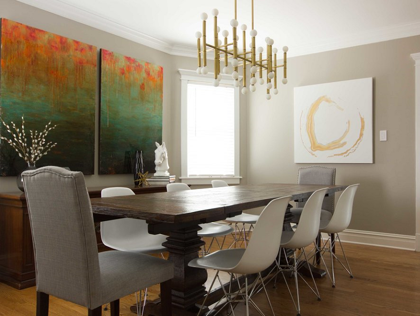
The question of why we are drawn to specific colors has always fascinated me, which is why I studied both Interior Design AND Psychology back in college (and continue to learn about it to this day). To me, they’ve always gone hand in hand.
What can color do? Color can change perception, influence mood, and turn heads. It can put you at ease, inspire conversation, and inspire that ahhh feeling when you walk in the front door. In other words, emotion and color can’t be separated!
From designing stunning homes that every eye will appreciate to navigating exactly how people want their individual spaces to feel, I love that I get to weave the psychology of color into every project we take on.
Here’s what you need to know...
What is color anyway?
Color has basic perceptual impact, meaning it influences how we see the world around us. Things such as light reflectivity, contrast, the ability to see edges, and the capacity to perceive distance are all influenced by color.
But color is also subjective. It has a profound emotional influence that varies from person to person - one color might make you feel alert, another restful, and very specific colors can even recall memories. And it could be the complete opposite for your neighbor down the road!
For example, while some people might see a vibrant orange as loud and obnoxious (hello cliché Halloween decor that used to adorn your childhood home), others might see it as stimulating and lively (like that beautiful bowl of oranges on the counter of the juice bar at the gym).
Each person’s interaction with any given color is unique. And no matter how you look at it, though, the experience of color is rooted in psychology...and let’s be honest, it is truly fascinating stuff!
What are the common associations of color?
If you’re a list lover like me, you’ll love this one — a color-by-color breakdown of some of the most common associations with each color. Again, these are subjective, so take each with a grain of salt.
Red
vibrant red is stimulating and confidence-boosting
deep red is associated with courage, strength, and power
less saturated versions (i.e. pink) can be romantic, playful, social, and softening
Orange
generally an invigorating and happy color
orange is lively and social
deeper shades of orange feel more grounded (like rust-colored orange tones found in the natural world - think stones and autumn leaves)
Yellow
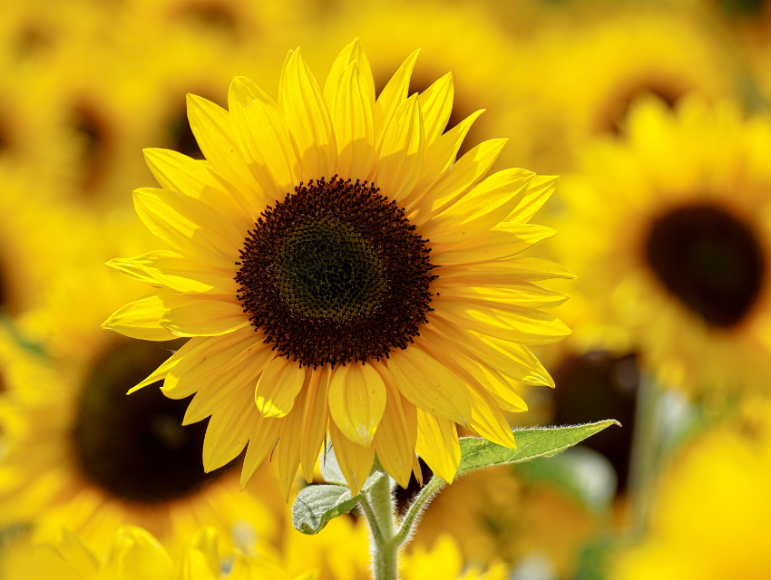
saturated yellows are associated with cheerfulness and sunshine
vibrant shades of yellow feel more energetic
deeper shades of yellow can feel moody, even earthy (think sunflowers and squash)
Green
found most abundantly in nature, green colors represent life and vitality
vibrant shades of green are both energizing and rejuvenating
soft shades of green are restorative and soothing
deep forest greens are calming, providing a sense of security
Blue
there are more shades of blue than any other color, which also means a wide range of contrasting emotions (like the ocean, many blues provide limitless feelings)
blue might be calming and serene, thoughtful and pensive, or playful and lively
dark navy blue is often associated with intelligence and is seen as a serious color
Purple
purple has historically been the color of royalty and luxury
deep shades of purple often feel moody
vibrant shades of purple evoke celestial thoughts, inspiring creativity
soft shades of purple, like lilac, have a lighthearted softening and soothing effect
If these color associations have your wheels turning, we encourage you to give some thought to the psychology of color in your own home. What you surround yourself with significantly impacts how you feel, and during these times when we are all spending the majority of our lives at home, the color of our surroundings is of the utmost importance. Don’t you think??
How does someone get in touch with their color preferences?
Step 1 - Get your nerd on.
Before you can truly understand your own color preferences (unless you’re having an expert explore these with you), you need some basic knowledge of color theory. Here’s some color terminology:
Color is the general term we use to describe every hue, tint, tone, and shade that we see.
Hue refers to the dominant color family of the specific color we are looking at. (Is it red in nature? Blue? Yellow?)
Tint is any color with white added...it lightens the color, but doesn’t brighten it. (A tint is often referred to as a pastel.)
Tone is any color with gray added….it lessens the intensity of the color, dulling it significantly, making it less vibrant. (A tone is often seen as a neutral.)
Shade is any color with black added...it darkens the color, ranging from slightly darker than the original to nearly black.
Side note: As our visual media has absorbed standards from other cultures and even simple regional differences, now that you know the meanings of these terms, you’ll begin to recognize various visual patterns being lifted from other places and applied into our day-to-day preferences.. I told you this was neat!!
Step 2 - Look through your closet.
Yes, you heard me right. The closet is a great place to start because people like colors that look good on them; it’s just how it goes. So, naturally we are drawn to those colors in other areas of our life as well...like our homes.
With the understanding of color theory that I just shared, look through your clothing, shoes, accessories, etc. with a discerning eye. Take note of whether you prefer tints, tones, or shades (how much lightness/darkness is there in your clothes?).
Are your clothes neutral or vibrant?
Do you gravitate towards the same colors over and over again?
Is there significant variance and contrast?
Do you prefer your colors mixed into patterns?
Step 3 - Jot it all down.
Take detailed notes while you’re in this frame of mind in order to apply these color preferences in your home as well. And to take into account your partner’s preferences, repeat this exercise in their closet as well. I bet you’ll be surprised by what you take away from this simple exercise and eager to implement these color preferences into your surroundings at home.
How does understanding psychology help with the design process?
Okay, last but not least, I can’t help but share a bit more about the role of psychology in design… because it is so overlooked!
In undergrad, I studied two main disciplines in Psychology - Personality, and Cognition & Perception. Both come in equally handy throughout the interior design process.
Your Personality
For example, when flexing my training in Personality, I find myself listening to the clients audibly and visually (meaning that I’m always looking for body language cues). Sometimes, one person in a partnership is a bit more reserved and won’t share their desires to the strange designer (aka me) in their home.
Because of my background, I am able to pick up on this and reorient the conversation so that every voice is heard. Similarly, during difficult conversations, I try to reassure clients that compromises are part of the process and can gently lighten the mood. It is also the training in Personality that helps me take cues from clients’ clothing and artwork that hint at their color preferences.
Fun fact: there are typical color preferences based on personality - extroverts tend toward warm colors, while introverts prefer cooler colors - so intriguing!
Your Perception
On the flip side, my Cognition & Perception background helps me to recognize visual cues for defining and separating spaces (like the fact that a long hallway almost always needs a large element to break the space up to assist with wayfinding).
And don’t get me started on the important physiological factors to consider. For example, the lenses in our eyes as we get older start to slightly yellow, therefore altering our perception of color. The older our clients, the greater the need for bright, high-contrast spaces filled with saturated colors!
It’s all a beautiful balance
All of these little nuances add up to big impact. By understanding the psychology and physiology behind colors, as well as getting to know our clients on a personal level, we are able to create spaces perfectly suited to each homeowner’s lifestyle, emotions, preferences, needs, and desires.
If you’re ready for a home that feels just as great as it looks, give us a call. We are uniquely positioned to create spaces that look stunning while also tapping into the psychology of color to evoke the emotions you desire in your home.
Whether you’re looking for a calming oasis where you can fully relax, or a vibrant abode that inspires creativity, we are here for you!
Until next month,
Kathryn


